In the digital age, communication is easy to access. Every detail can affect how we interact and work. You’ve probably noticed the growing debate surrounding light versus dark themes—especially on apps like WhatsApp.
One creates a bright and cheerful atmosphere. The other has a sleek and modern feel. Many people find this easier on the eyes during late-night talks. But have you ever stopped to consider how your choice of theme might impact your productivity?
In this blog post, we will explore WhatsApp themes. We will look at their beauty and how they can affect focus, engagement, and efficiency.
Grab your phone as we start this colorful journey. Will you enjoy the bright light or explore the mystery of the dark? Let’s find out which theme propels you toward peak productivity!
Introduction to the topic of WhatsApp themes and productivity
In a world where communication is just a tap away, WhatsApp has become our favorite app. It helps us connect with friends, family, and colleagues easily. Have you ever thought about how the design of this popular messaging app can affect your productivity?
Enter the age-old debate: light vs dark themes. While some users swear by the crisp clarity of a bright interface, others find solace in the sleek elegance of darkness.
As we dive into this colorful discussion, let’s look at how these themes can affect your mood and efficiency. Grab your phone, and let’s unravel which WhatsApp theme might give you that productivity boost you’ve been searching for!
Explanation of the light and dark themes on WhatsApp
WhatsApp offers users two distinct themes: light and dark. Each theme serves a different visual experience tailored to user preferences.
The light theme features a bright, white background with colourful accents. It’s reminiscent of traditional messaging apps, providing clarity and vibrancy. This design can be refreshing during the day when natural light is abundant.
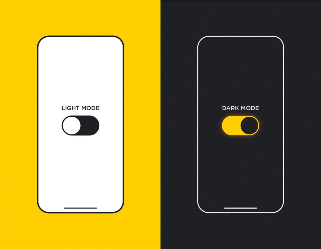
On the other hand, the dark theme boasts a sleek black or deep grey background that minimizes eye strain in low-light settings. The pronounced contrast between the text and background makes conversations pop while remaining gentle on your eyes at night.
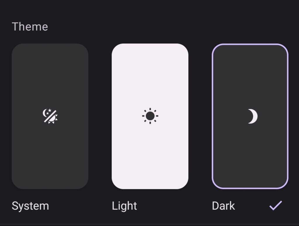
Both themes aim to enhance usability while catering to various environments and individual tastes. Users can easily switch between these two options based on their mood or lighting conditions throughout the day.
Research on how different colours impact productivity
Colours have a profound effect on our mood and productivity. Research suggests that certain hues can enhance focus and creativity, while others might induce fatigue or distraction.
For instance, people often link blue with calmness and concentration. Many workplaces use it to create serene environments conducive to deep work. Green, associated with nature, can help reduce stress levels and improve overall well-being.
On the flip side, colours like red may evoke urgency but could also lead to feelings of agitation if overused. Bright yellows can inspire creativity; however, too much brightness can be overwhelming.
Understanding these colour dynamics allows users to make informed choices about their digital environments. This idea goes beyond WhatsApp themes. It applies to any tool we use often in our daily lives.
Advantages and disadvantages of using a light theme on WhatsApp
The light theme on WhatsApp offers a clean and bright interface. Many users find it visually appealing, especially in well-lit environments. This brightness can enhance readability, making messages easier to see during the day.
However, a significant downside is eye strain. Prolonged exposure to bright screens can lead to discomfort, particularly in low-light settings. Users often report fatigue after extended use.
Another advantage is that the light theme feels familiar and straightforward for most smartphone users. It’s what we typically expect from apps, creating a sense of comfort.
Yet this familiarity might also breed complacency. Some people may miss important features because they focus too much on looks. They should consider usability and productivity improvements from other themes.
Advantages and disadvantages of using a dark theme on WhatsApp
A dark theme on WhatsApp can be a game-changer for many users. One of its standout advantages reduces eye strain, especially in low-light environments. The softer contrast between dark backgrounds and light text makes reading messages more comfortable during nighttime.
Battery life is another plus. Smartphones with OLED screens use less power with a dark theme. This is because black pixels do not need energy to light up. This can lead to longer usage times without needing a recharge.
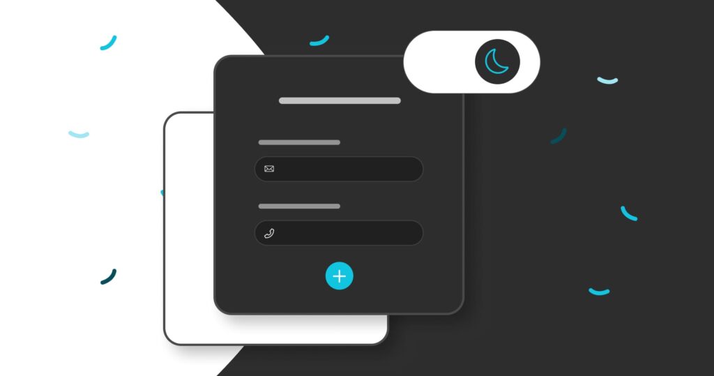
However, not everything about the dark theme is rosy. Some people find it harder to read bright texts against darker backgrounds in well-lit conditions. It may take time for your eyes to adjust if you prefer lighter themes.
Additionally, certain emojis or images appear differently than intended due to contrasting colours, which could impact communication clarity. These nuances matter when productivity hinges on seamless exchanges.
User testimonials or personal experiences with each theme
Many users have shared their experiences with WhatsApp’s themes, reflecting a mix of preferences. Sarah, a graphic designer, swears by the dark theme. She finds it easier on her eyes during long nights of work. “It feels like a cozy cave,” she says.
On the other hand, James from marketing prefers the light theme for its vibrant and clean look. “Everything pops out more,” he explains. He believes that bright backgrounds help him stay alert while juggling multiple chats.
A few users have noted that switching between themes based on time of day boosts their focus. Emily mentions using light in daylight and dark at night to reduce eye strain.
These personal insights highlight how individual needs shape productivity levels when using WhatsApp’s different themes. Everyone has unique workflows and environments influencing their choices, creating varied user experiences across both options.
Tips for choosing the right WhatsApp theme for increased productivity
Choosing the right WhatsApp theme can significantly enhance your productivity. Start by assessing your work environment. If you’re often in bright places, a light theme might be beneficial to reduce glare and eye strain.
Consider your personal preferences, too. Some users find dark themes less distracting during long sessions of messaging or video calls. Experiment with both themes to see which resonates more with your workflow.
Think about the time of day when you use WhatsApp most frequently. For night owls, a dark background is easier on the eyes and can help maintain focus without harsh lighting interruptions.
Also, remember that customizing notifications can complement whichever theme you choose. Tailored alerts will keep you engaged without overwhelming distractions—key for maintaining that productive flow!
How to switch between light and dark themes on WhatsApp
Switching between light and dark themes on WhatsApp is a breeze. First, open the app on your device.
For Android users, tap the three dots in the top right corner. Select “Settings,” then navigate to “Chats.” Here, you’ll find an option for “Theme.” Tap it, and you can choose between Light, Dark, or set it to follow your system settings.
iPhone users will take a slightly different route. Open WhatsApp and go to “Settings” at the bottom right corner. Tap on “Chat,” then select “Theme.” Choose from Light or Dark options as desired.
Remember that these changes apply immediately without needing to restart the app. Enjoy customizing your experience based on your mood or lighting conditions!
Other ways to boost productivity while using WhatsApp
To elevate your productivity on WhatsApp, consider organizing chats with labels. This simple adjustment helps prioritize conversations and manage tasks effectively.
Utilizing WhatsApp’s starred messages feature can also be a game changer. By marking important messages, you can easily locate them later without scrolling through endless threads.
Turning off non-essential notifications is crucial, too. This reduces distractions and keeps your focus sharp when tackling work-related discussions.
Integrating voice notes into your communication can save time as well. Instead of typing long messages, express ideas quickly by speaking them out loud.
Finally, setting specific times for checking messages fosters discipline. Allocate dedicated intervals during the day to engage with WhatsApp while maintaining uninterrupted periods for deep work.
Conclusion: the ultimate decision between a light or dark theme for productivity
Choosing between light and dark themes on WhatsApp ultimately comes down to personal preference and your specific productivity needs. The light theme provides clarity in bright places. This makes it easier for some users to read messages without straining their eyes. However, prolonged exposure can lead to discomfort or fatigue.
The dark theme offers a calming visual experience. It can help improve focus in low-light conditions. It reduces glare and many people often consider it gentler on the eyes during extended use periods.
User experiences can be very different. Some people do well with one setting. Others get better results by changing themes.
This can depend on the time of day or their activity level. Experimenting with both options could be beneficial until you discover what truly works for you.
Consider not just aesthetics but also how each theme affects your workflow and comfort throughout your workday. Trying out different settings will help you find which ones improve your efficiency best. This is important as you navigate conversations in WhatsApp, which Meta manages.
Paying attention to how these visuals impact your mood and productivity will help you make a choice that fits your lifestyle.


